Planet Word Rebrand
brand Id, Logo Design, Brand Guide
Planet Word is a DC museum dedicated to words and language. This case study aims to create a brand identity that maintains the youthful palette of the current branding while pulling in elements from the architecture of the historic school building that houses the museum.



About Planet Word
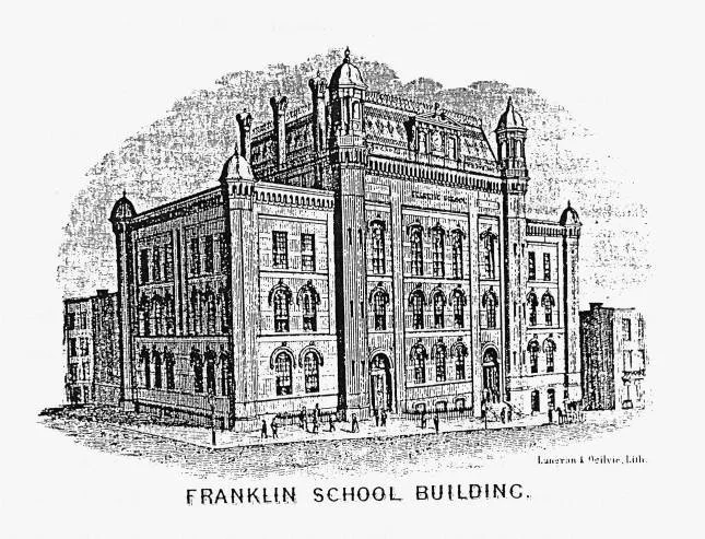
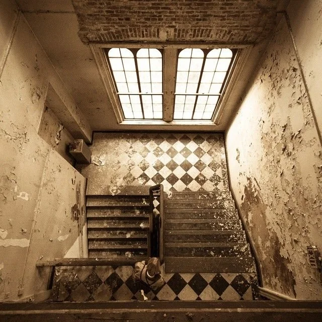
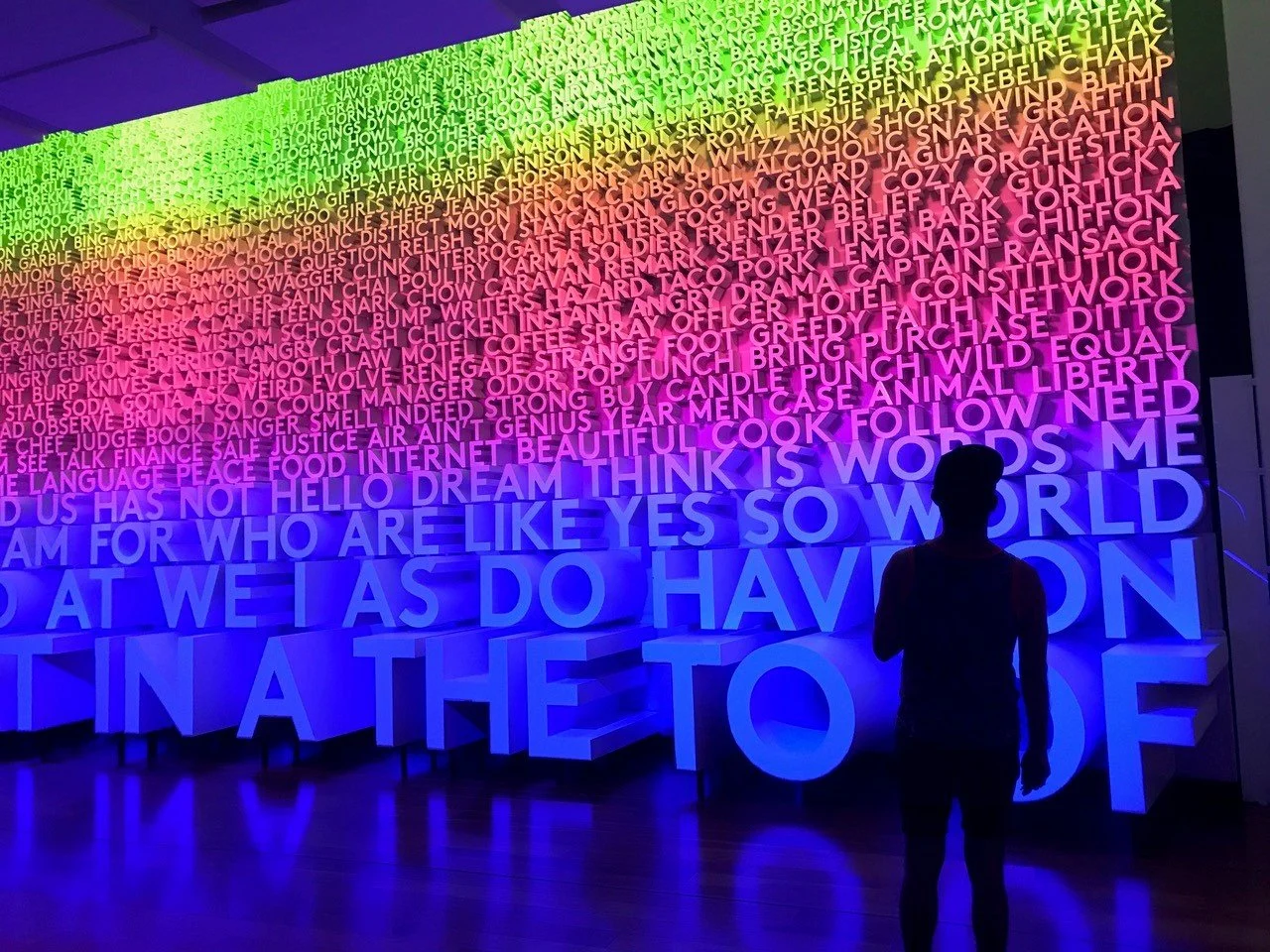
Located in DC at the historic Franklin School, Planet Word “is the only museum in the country dedicated to renewing and inspiring a love of words and language.” Through interactive experiences, they strive to make the museum fun, playful, unexpected, motivational, meaningful, and inclusive. These are their six core values.
Planet Word founded by retired first grade reading teacher Ann B. Friedman was inspired by the Museum of Mathematics in New York City—an interactive museum focused on fun, educational activities. She wondered what if there was a place like that, but for words, reading, and language? That’s how Planet Word was born. Planet Word is committed to the community by partnering with groups who serve children and adults with low literacy. They strongly believe that literacy is the foundation of a strong democracy. “Planet Word is a bold and imaginative response to the life-long importance of literacy.”

Rebrand Strategy
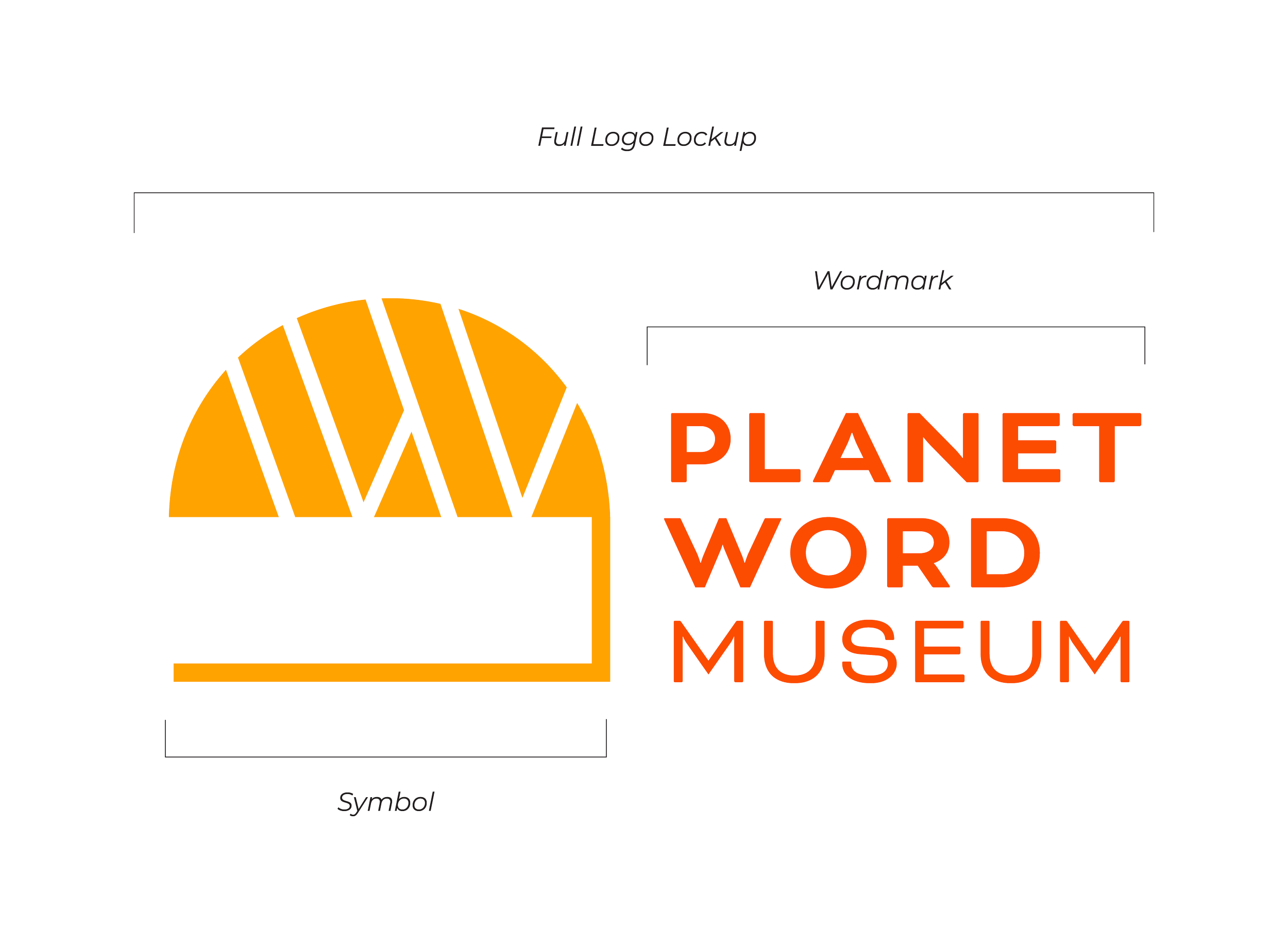
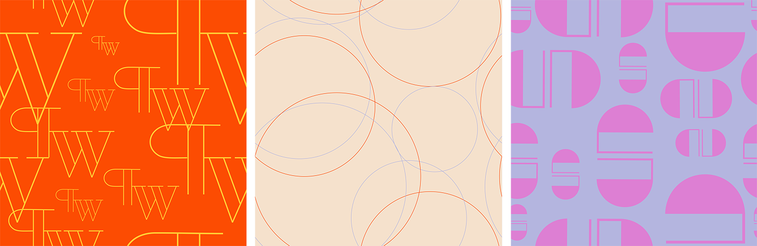
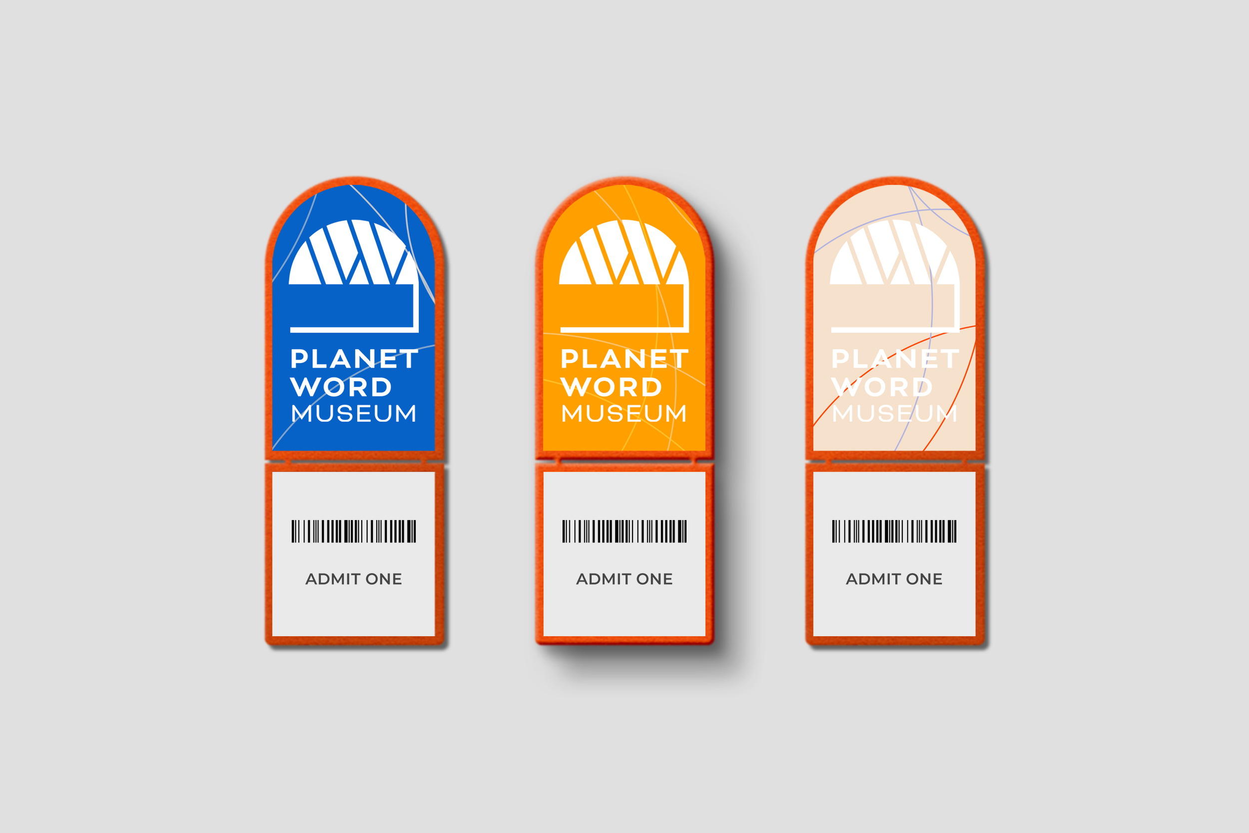
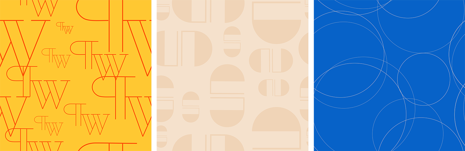
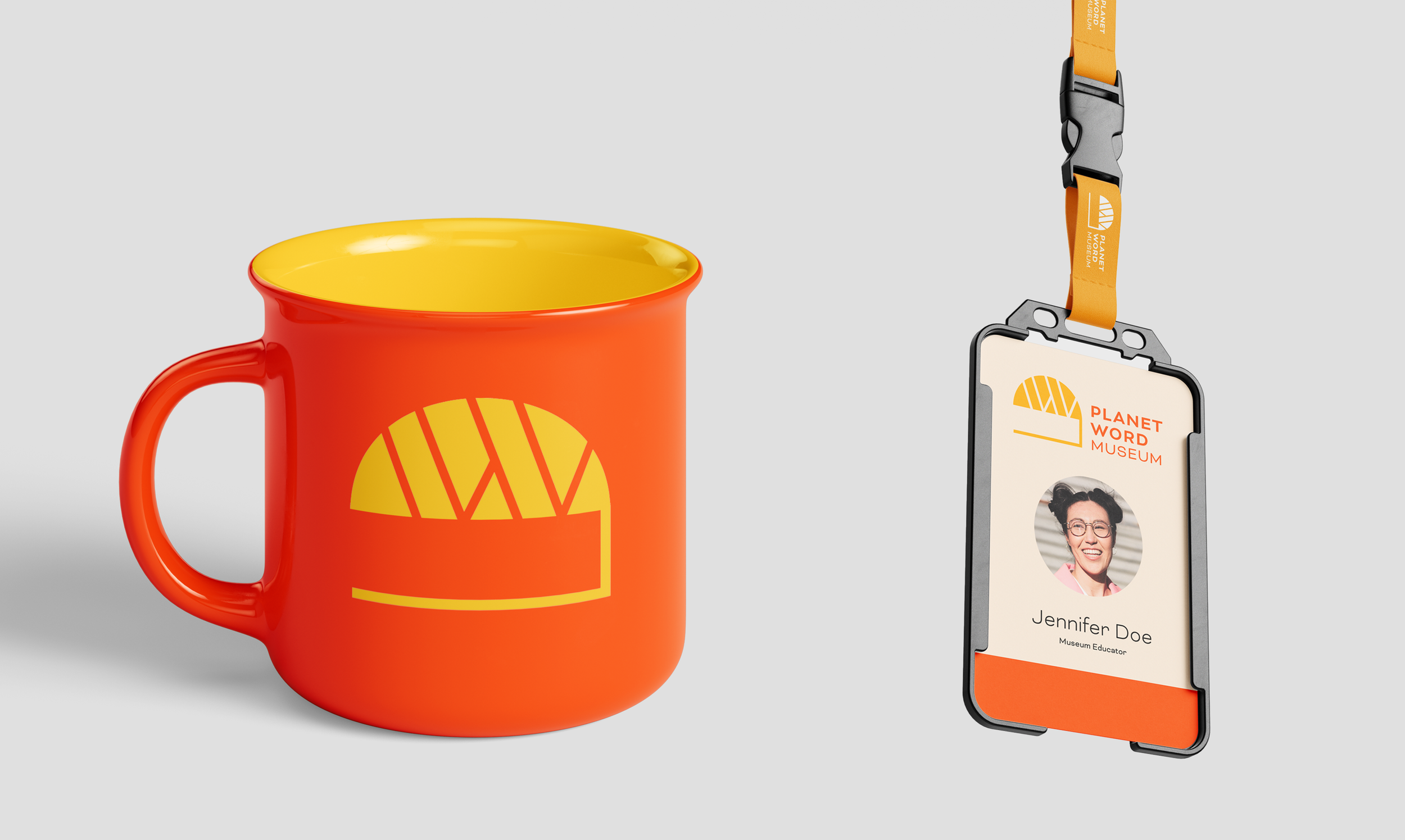
The aim was to create a brand identity that maintains the bold, carefree color palette of Planet Word’s current branding while pulling traditional elements from the architecture of its historic school building. The resulting logomark is a take on a paragraph marker that resembles the windows of the Franklin School and has a modern edge fitting with the sans-serif typefaces used in the wordmark and overall branding. The goal was to create something simple, but potentially iconic.


View the Brand Guidelines Book
Katie Mullen is a Boston-based marketer, designer, and writer passionate about storytelling in its various forms. She gravitates toward branding, visual identity, and editorial design along with campaign concepts, creative writing, and essays.